webstack
Baymard: 2020 and 2021
(Note: Unfortunately, e-mail and RSS don’t support advanced layouts and features. If the graphics in this article look strange, you may want to read the article in your web browser.)
With the end of an unusual 2020 nearing, here’s an overview of:
Baymard’s 10 most popular UX research articles in 2020,
the new UX research and features we’ve added in 2020,
the 8 new team members & our open UX Auditor position, and
what new research we have planned for the first half of 2021.
10 Most Popular Articles in 2020
The most popular UX research articles we published in 2020 were:
The Current State of Checkout UX – 18 Common Pitfalls
Always Explain Why the ‘Phone’ Field Is Required – 58% of Sites Don’t
Always Use Thumbnails to Represent Additional Product Images – 76% of Mobile Sites Don’t
Product List UX: The Number of Products to Load by Default – 52% Get it Wrong
Six ‘COVID-19’ Related E-Commerce UX Improvements to Make
6 Important Aspects of Well-Performing Mobile Product Page B..
How volunteering for a crisis hotline makes me a better designer
I’m going to tell you something about myself that will make me sound extraordinarily privileged: hearing stories from those contacting our…
Continue reading on UX Collective »
Do we do enough problem-finding before problem-solving?
Paying attention vs. Getting attention
Continue reading on UX Collective »
How to create powerful technologies that are reliably at our service
The not-so-futurist issue of “super-intelligent IA”
Continue reading on UX Collective »
9 Easy Ways to Deal With Difficult Clients
Naturally, there are bad clients out there, but 90% of the time, it’s not really the client who is at fault. Poor communication, a lack of setting expectations, and a failure to qualify clients beforehand is usually the problem.
If you’re dealing with a problematic client, there’s usually not a lot..
Integrating TypeScript with Svelte
Svelte is one of the newer JavaScript frameworks and it’s rapidly rising in popularity. It’s a template-based framework, but one which allows for arbitrary JavaScript inside the template bindings; it has a superb reactivity story that’s simple, flexible and effective; and as an ahead-of-time (AOT) c..
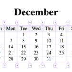
A Calendar in Three Lines of CSS
This article has no byline and is on a website that is even more weirdly specific than this one is, but I appreciate the trick here. A seven-column grid makes for a calendar layout pretty quick. You can let the days (grid items) fall onto it naturally, except kick the first day over to the correct f..
10 Great Start-up and Digital Nomad Resources Online
There are plenty of places to find information online about running a business and starting out as a freelancer or entrepreneur. We gathered 10 of the very best resources to get you started.
Seth Godin’s BlogSeth Godin is a business guru. His material is remarkably well written (it should be – his books sell millions of copies), and you can find loads of free and actionable advice on his blog.
http://www.sethgodin.com/sg/
Tim Ferriss’ blogTim’s book The 4-Hour Workweek is something of a freelance/entrepreneurial/digital nomad bible. His blog is full of tons of extra information which he gives away for free. We don’t always agree with Tim, and we think it’s going to be very hard for a free...
Custom Styles in GitHub Readme Files
Even though GitHub Readme files (typically ./readme.md) are Markdown, and although Markdown supports HTML, you can’t put ');
var formated_str = arr_splits[i].replace(/\surl\(\'(?!data\:)/gi, function regex_function(str) {
return ' url(\'' + dir_path + '/' + str.replace(/url\(\'/gi, '').replace(/^\s+|\s+$/gm,'');
});
splited_css += "";
}
var td_theme_css = jQuery('link#td-theme-css');
if (td_theme_css.length) {
td_theme_css.after(splited_css);
}
}
});
}
})();


