webstack
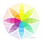
Putting Some Emotion into Your Design – Plutchik’s Wheel of Emotions
Emotional design is a big buzz word within the UX community. Designs which tap into the user’s emotions are considered to do more than just respond to their stated needs and provide a greater level of user experience. One way of understanding emotions is Plutchik’s Wheel of Emotions – this may help you deliver better experiences to your users when designing products.
10 things I wish I knew before my first corporate UX design job
Almost two years ago I sat down in front of a computer screen, in an open office space, waiting. I was nervous, eager to start and terrified. This is what I wish I had known before sitting down in that chair.
The first 5 could be applied to most jobs and, the next 5 are specific to UX Design. I started my first job in the corporate world without knowing too much about their plans, vision or past, and whether I could be a good fit. I was simply too excited about being hired right after graduation, (finally earning good money ) to take a step back.
What is a heuristic evaluation In UX
In this article we’ll be taking at look at what exactly UX designer’s mean by the term “heuristic evaluation”, how to conduct a heuristic evaluation for yourself,
what to do if you can’t afford a usability expert, and the difference between a heuristic evaluation and user testing.
You can tap on any of the links below to jump to the respective section. So, let’s get started!
Choosing the Right Web Design Conference
There are a number of events out there targeted towards web designers. You will come across everything from small meetups to large corporate blowouts. Each of these opportunities has something unique to offer.
Personally, I tend to prefer WordCamps over other types of events. The laid-back atmosphe..
A New Framework for UX Heuristics
Earlier this week I had a check in with a UX Designer I had a hand in training before we hired her at the Studio. Being a new transfer into the field, she likes to check with me when she faces a challenge for the first time. Deb Zell recently asked her to do some heuristic reporting on several inbound projects. The question that came up in our meeting was essentially “how do I report on this in a way that moves us forward?” — and I had to admit the existing structures were creating a lot of noise without a clear signal.
A Stakeholder Interview Checklist
This is an excerpt from from Kim Goodwin’s excellent Designing for the Digital Age. It is quite long, so we’ve broken it into several...
The Hamburger & Mega-Menu Combination Design Trend
Hamburger icons are everywhere. They carved a niche for themselves without any intention to leave us anytime soon. Hate it, love it – just...
The Hamburger & Mega-Menu Combination Design Trend
Hamburger icons are everywhere. They carved a niche for themselves without any intention to leave us anytime soon. Hate it, love it – just deal with it. Much like the real world, online expanses, including both web and mobile interfaces, have some tasty and irresistible junk food.
Taking web by sto..
Weekly News for Designers № 460
Stop building websites with infinite scroll! – Reasons why the feature can hurt UX.
Design in China – Interview with Chinese studio A Black Cover Design.
Every Website in 2018 – We don’t really do this, do we?
The Design Trend of Using Triangles in Web Design – A look at websites that use the geo..
12 Beautiful Websites with Sunrise-Inspired Color Schemes
What guides you when it comes to choosing a color scheme for your project? I bet you have some arguments and principles. For instance, we are all aware of the fact that every color has its personality and psychological undertone – making it responsible for evoking specific emotions.
For example, bl..

