webstack
Thoughts on Building WordPress Membership Sites
The idea of a membership website is quite broad. Really, it can be anything from an organization that charges members for access to content or a simple community bulletin board. In between, you’ll find all sorts of niche requirements. In many ways, it’s akin to eCommerce in that there are any number..
The Design Trend of Using Triangles in Web Design
You may wonder: “What can be so special about triangles? It is just a plain, primitive geometric shape. Not even a circle or square that have a hint of perfectionism.” And, you are absolutely right (at first). There is nothing special about it.
However, it is the first-ever polygon. It consists of ..
Driving More Conversions with Conversational Designs
At times, it seems like eCommerce is a never ending search for conversions; for a strategy that leads to sale after sale.
But, as you’ve undoubtedly realized by now, that’s sadly not possible.
Sure, you can do something here and something there that will help you out—to a certain extent—but nothing..
The Grumpy Designer: Email Is the Worst
Web designers are often saddled with the unenvious task of dealing with email. And it’s not limited to just our own overflowing inboxes. We can also find ourselves in situations where we’re attending to our clients’ email as well.
As you may have noticed, email is rife with problems. Between excess..
Weekly News for Designers № 459
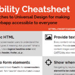
Accessibility Cheatsheet – A handy checklist for ensuring your designs are accessible to all.
8 Code Snippets to Make Your Pagination Pop – Help your pagination stand out.
How to Display Content Based on WordPress User Roles – Code snippets that detect user roles and capabilities.
GitHub Launches..
How Not to Design a Product Like Everyone Else’s
Why all the products on the market look the same?
Have you ever been searching for a product that could solve your needs but could not choose one because all somehow look the same? Or it becomes harder for you to choose between 2 services because they offer the same features? The only thing that di..
Designing a Styleguide: Elements That Go Into Building Compelling Products
If you look at companies like Dropbox, Google, and Twitter you’ll notice that they each have their own unique aesthetic. Across all their products, both mobile and web, there is a sense of consistency and uniformity in their design.The way that companies and products achieve consistency is through s..
What is a Design System Anyway?
‘Design Sprints’, ‘Agile’, ‘Stand Up’, ‘Lean’ - Is ‘Design System’ just another one of those buzz words we hear?
It really depends on how you choose to look at it. I find that everything that’s ‘trendy’ or ‘buzz-wordy’ is usually so for a reason. There is a lot of innovation in the design systems sp..
How to Improve the UX of Your e-Commerce Website Visitors
You're reading How to Improve the UX of Your e-Commerce Website Visitors, originally posted on Designmodo. If you've enjoyed this post, be sure to follow on Twitter, Facebook, Google+!
One of the main parts of a high-level website is undoubtedly a great user experience. …
6 Creative Ways to Use Repeat Grids in Adobe XD
You're reading 6 Creative Ways to Use Repeat Grids in Adobe XD, originally posted on Designmodo. If you've enjoyed this post, be sure to follow on Twitter, Facebook, Google+!
AdobeXD recently made a big splash during their announcement because of a few unique features, …


