The Single Usability Metric (SUM) — A completion rate conundrum
The Single Usability Metric (SUM) — A completion rate conundrumTL;DR — In the SUM benchmarking method, the calculation of completion rates creates a bias for completion rates which artificially inflates all ‘good’ scores and marks some ‘poor’ scores as ‘good’. I cover two methods to augment the SUM ..
Rethinking specialization: The return of the generalist
Breaking Down Siloes and Becoming Cross-Functional Enablers is the Future of UX
Continue reading on UX Collective »
The battle for design titles
Are you a UX/UI/Product/Interaction/Full-Stack/Visual/Digital Designer and how would you know?Working Hard • Illustration by Julia from Icons8There’s a hot debate happening on the web right now regarding Design titles. Some say we should stop saying “UX/UI Designer” — whether or not you agree with t..
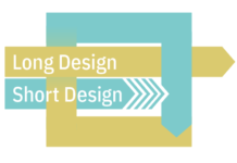
Short and long-term thinking in design: here’s why you need both
There is long design and short design. They are not the same, and you need them both.
Continue reading on UX Collective »
Understanding DesignOps as a strategic function — PART 2
PART 2Understanding DesignOps as a strategic function: measuring impactPart 2 of 2DesignOps relies on ongoing performance assessments to constantly evaluate what can be done better to impact positively the business metrics. Yes, DesignOps’ impact is quantifiable.
Credits: https://www.pexels.com/@nie..
What Japan can teach us about UX and product design
Image by Luca Florio Photo of fox statues at a shrineIn a previous article, I wrote about what Japan can teach us about UX and Universal Design. However, Japan's product design is another area of ux design success; both in its approach to the aesthetic qualities and its functionality. Here are ..
Signal app: a UX analysis
I spent a week on Signal to understand what lies behind the hype.Understanding what lies behind the hypeThis post focusses on the user experience on Signal and not on Whatsapp’s updated privacy policy.It’s hard to compete with headlines of Trump becoming the only president in US history to get impea..
The curb cut effect: How universal design makes things better for everyone
It was a beautiful day in Santa Barbara, California, and I was walking down to work listening to an episode of my favorite podcast 99%…
Continue reading on UX Collective »
Mapping the context of iconography
Viewing Google Maps icons through the perspective of ancient mapsAlaska (Prince of Wales Island), Copper Mountain and vicinity, 1909, by Sargent, R. H.The smell of aged parchment and centuries-dried ink, the slight sound of large sheets rustling and flat drawers rolling open, the soft feel of worn a..
How industrial designers can become “The Bridge” between physical/digital
In search for the missing link between physical and digital that will enable more meaningful and tangible experiences.Illustration by AuthorIn my 10+ years working for both in-house teams and design consultancies I’ve had the opportunity to work for large, Fortune 500 companies as well as early-stag..


