Weekly News for Designers № 460
Stop building websites with infinite scroll! – Reasons why the feature can hurt UX.
Design in China – Interview with Chinese studio A Black Cover Design.
Every Website in 2018 – We don’t really do this, do we?
The Design Trend of Using Triangles in Web Design – A look at websites that use the geo..
12 Beautiful Websites with Sunrise-Inspired Color Schemes
What guides you when it comes to choosing a color scheme for your project? I bet you have some arguments and principles. For instance, we are all aware of the fact that every color has its personality and psychological undertone – making it responsible for evoking specific emotions.
For example, bl..
Thoughts on Building WordPress Membership Sites
The idea of a membership website is quite broad. Really, it can be anything from an organization that charges members for access to content or a simple community bulletin board. In between, you’ll find all sorts of niche requirements. In many ways, it’s akin to eCommerce in that there are any number..
The Design Trend of Using Triangles in Web Design
You may wonder: “What can be so special about triangles? It is just a plain, primitive geometric shape. Not even a circle or square that have a hint of perfectionism.” And, you are absolutely right (at first). There is nothing special about it.
However, it is the first-ever polygon. It consists of ..
The Grumpy Designer: Email Is the Worst
Web designers are often saddled with the unenvious task of dealing with email. And it’s not limited to just our own overflowing inboxes. We can also find ourselves in situations where we’re attending to our clients’ email as well.
As you may have noticed, email is rife with problems. Between excess..
Weekly News for Designers № 459
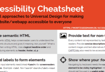
Accessibility Cheatsheet – A handy checklist for ensuring your designs are accessible to all.
8 Code Snippets to Make Your Pagination Pop – Help your pagination stand out.
How to Display Content Based on WordPress User Roles – Code snippets that detect user roles and capabilities.
GitHub Launches..
6 Creative Ways to Use Repeat Grids in Adobe XD
You're reading 6 Creative Ways to Use Repeat Grids in Adobe XD, originally posted on Designmodo. If you've enjoyed this post, be sure to follow on Twitter, Facebook, Google+!
AdobeXD recently made a big splash during their announcement because of a few unique features, …
Introducing Marvel + Sketch
Our brand new Marvel + Sketch integration features some new additions which will level up your designs, prototypes and the way your whole team works.
It's the complete end-to-end design solution for Sketch. We've focused on building features which help improve your efficiency, so you hav..
How We Optimised Prototype Image Loading
To build prototypes in Marvel, all you need to do is import your designs. Whether they're low-fi wireframes you drew on paper or hi-fi prototypes you built in Sketch, you can add these as static images to a project and make them interactive by adding hotspots. These hotspots link together your ..
UX Best Practices for Using Search on Your Website
You're reading UX Best Practices for Using Search on Your Website, originally posted on Designmodo. If you've enjoyed this post, be sure to follow on Twitter, Facebook, Google+!
When a website contains a lot of content, your viewers are often not sure how …


