Is the end near for flat logo design?
Oversimplified logos: when less becomes too much.Logos speak a thousand words. A great logo can tell the story of an organization without a single word. Recently, logos from various companies have experienced a transformation. From car companies like GM, restaurants like Burger King, and food produc..
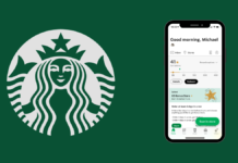
Why the Starbucks app is design perfection
I love my barista, but I’d much rather use the app. The UX on the Starbucks app is so close to perfect it’s setting industry standards.
Continue reading on UX Collective »
Figma for education: Design for learning experiences
Why would a teacher be interested in Figma? Why would a designer be interested in classroom prep?Join our little Figgy educators group.Currently, I work in the EdTech product design industry (K-12) as an experience designer. I am a former 7th-grade science teacher and am planning to return to the cl..
How to avoid using gradients like a lunatic
Gradients are everywhere you look these days and it appears they aren’t going anywhere anytime soon. Here is how to harness their power…
Continue reading on UX Collective »
Bringing self-compassion into product management
Encouragement to shift your perception of what ‘high performing’ looks like
Continue reading on UX Collective »
A gentle rant about the usability of user accounts
I am often underwhelmed and decidedly un-delighted when faced with managing my account on your site. Here’s how to make it better.
Continue reading on UX Collective »
Designers: mind your language
I sometimes wonder how the design community — a group of people who pride themselves on their empathy and ability to communicate clearly — have been able to create such an unapproachable profession. For outsiders, the litany of buzzwords, methodologies, and rules can at best confuse newcomers, and a..
Search or navigation? How familiarity affects naming and behavior
In cognitive psychology research, familiarity will cause people to use different names for an object, which may explain e-commerce users’ search or browsing behaviors.Do you know what’s in the cup in this picture?Photo by Ke Vin on UnsplashThis is the alcoholic drink — a Mojito!
If your answer was “..
Testing fonts for accessibility
Selecting accessible fonts for your copy is not just to help users with disabilities and special needs – it increases legibility for all…
Continue reading on UX Collective »
“What if we just…?”
A designer’s worst nightmare
Continue reading on UX Collective »


