NFT for designers, Google’s UX degree, Figma accessibility kit
Weekly curated resources for designers — thinkers and makers.NFTs, or non-fungible tokens, are unique and distinct bitcoin assets. While one Bitcoin is identical to and interchangeable with another, each NFT is unique, with distinguishing metadata and identification codes. NFTs are certificates of a..
How to choose your design career path?
Product designer’s guide to working in techPhoto by Matheus Bertelli on PexelsCareer perceptionFor us, designers (or people who work in creative industries) career helps to define who we are as human beings. It’s part of our identity and has an effect on ourselves, our family, as well as our surroun..
Your new UX superpower: Business acumen
https://unsplash.com/photos/ArA3S3k0wTU“So, how do you decide between user needs and business needs?”I get this question all the time. Mostly, I hear it from people who are in the process of transitioning from a post-grad program into their first UXR job at a for-profit company. It hints at an under..
Early-career UXers: Your most impressive work is missing from your portfolio
Let’s talk about what early-career UX folks should put in their portfolio and in interviews, especially when searching for the first job.
Continue reading on UX Collective »
Is the pandemic accelerating the fourth industrial revolution?
Opportunities and risks to watch out in 2021’s digital revolution
Continue reading on UX Collective »
Framer is still alive and well… and its a game-changer
Framer is still alive and well… and it’s a game-changerA love letter to my prototyping tool of choice.Earlier, this week, this post came across my feed: “Framer is Dead.”
Impossible. I’ve been using it non-stop for the past month.
Sadly, this post has gotten some traction, and I’ve seen it pop-up on..
The human working memory and the implications on Apple CarPlay
Today there are more things fighting for our attention than ever before. We are constantly juggling work, family, and social lives. What we don’t realize is, try as we might to multitask, our attention span is quite limited. Recent findings suggest that we can hold about four items (plus or minus 1)..
How to do user-centered design during the remote work period
The article was originally published at fraktio.fi in Finnish.
The COVID-19 pandemic emptied offices worldwide and forced many of us to work remotely from their homes last spring. Consequently, designers — including myself — and teams in general have had to adjust their ways of working. Nurturing us..
Misused products, Robinhood UX, is Framer dead?
Your weekly list of curated design resources, brought to you by your friends at the UX Collective.There is a portion of the American legal system under the category of negligence called “strict product liability,” also referred to as SPL. Under SPL, anyone in the product chain (seller, distributor, ..
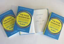
The 4 Tendencies and how we can use them in user experience design
What if all our users fall into these four groups?
Continue reading on UX Collective »


