A rant and a wishlist for ed-tech in India
Re-imagining EducationQuality Education is a service design problem.Photo by olia danilevich from Pexels(This article was “written in public”. After a skeleton draft was posted on LinkedIn and Twitter seeking feedback, the attributed responses below were used to further refine and add to the key tak..
Enterprise UX is amazing. Change my mind.
Why this under-represented but widespread design field comes with lots of unique and interesting challenges.As promised, here is a follow-up piece to my previous post — Part 1: The differences between enterprise and consumer UX. This follow-up is a bit less objective and instead, deeply rooted in my..
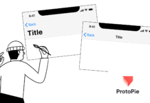
Prototyping the iOS navigation bar in ProtoPie
This tutorial explains how to prototype the default iOS top navigation bar in ProtoPie, so that it shrinks when scrolling.
Continue reading on UX Collective »
Interfaces in the 80s: Creating GUIs before it was cool
Exploring an interface design tool from the late 1980s which silently revolutionized the industry forever since.Recently I was going through some early implementations of current operating systems to familiarize myself with the evolution of GUI mechanics over time. One particular thing that caught m..
Why my mom should replace judges of design awards
Toddler explaining their mother how to use a tablet — Photo by Alexander Dummer on UnsplashI am fascinated by the winners on award websites that judge the UI of products and the realizations that are digital pieces of art. Professional designers assess several submissions and rate them on several cr..
The A to Z of UX — H is for Heuristics: 10 UX principles to assess...
Heuristics are a well established and accepted list of UX principles used to assess how well a user interface has been designed for its…
Continue reading on UX Collective »
Accessibility starter kit for designers
Illustration by Valerija TraneIn my previous article, I tapped in the idea of how “Digital Accessibility” is another word for “empathy” where I laid out the moral behind the emerging and quite popular “digital accessibility” trend. After establishing the vision and possibly answering some “why”s I w..
UX Psychology #3: how Tesler’s Law makes your designs fail
Every UX has an amount of complexity you cannot play withPeople hate redesigns. Unless the original work is terribad, chances are the new version will be stomped even if it’s remarkably better.
Snapchat learned it the hard way back in 2018 after a major redesign that burned 35% of their revenue. Alt..
The public speaking side quest
Have you ever considered sharing your experience or knowledge with complete strangers?What I love about the design and tech community, is that people mostly say yes to this question. There is a sense of giving back to the community, almost like a rite of passage in one’s professional journey.
But li..
How to make sure your audience understands your visualization
User test to see if your message is understood
Continue reading on UX Collective »


