Personas – A Simple Introduction
Personas are fictional characters, which you create based upon your research in order to represent the different user types that might use your service, product, site, or brand in a similar way. Creating personas will help you to understand your users’ needs, experiences, behaviours and goals. Creating personas can help you step out of yourself. It can help you to recognise that different people have different needs and expectations, and it can also help you to identify with the user you’re designing for. Personas make the design task at hand less complex, they guide your ideation processes, and they can help you to achieve the goal of creating a good user experience for your target user gro...
How to Advocate and Evangelize User Experience
It’s getting better and better but, still, how many times have you had to justify why user experience matters and what it actually means? To be prepared, as part of your UX toolbox, you should have a set of examples and visuals to ground your arguments. Case studies are great ways to exemplify the relevance of UX for product and service development. Graphics are also great tools to become the perfect advocate of UX.There are lots of classifications and forms to provide a visual overview of the User Experience field. The truth is that UX is a pretty high level term and often too ambiguous for people outside the field. What does UX exactly mean? Is it a philosophy, a process, a guideline, a st...
Design is all about details
When it comes to product design, details play a critical role in product
success. Product teams spend countless hours polishing details and
perfecting their design. But details...
The Principles of Service Design Thinking – Building Better Services
Service design is all about taking a service and making it meet the user’s and customer’s needs for that service. It can be used to improve an existing service...
Best Design Practices for Single-Page Websites
Debates around single- and multi-page websites are ongoing. Because they’re faster to create and easier to maintain, single-page websites often have an advantage over multi-page ones. However, despite its...
The Grid System: Building a Solid Design Layout | Interaction Design Foundation
Now that we’ve seen some grids at work in the Rule of Thirds article, let’s examine them a little more deeply. As a concept that deals so fundamentally with...
Facebook Purge’: List of Some Deleted Accounts on Left & Right
Facebook has removed – in what some are calling the “Facebook purge”- more than 800 pages and accounts. Although the social media giant says those deleted were rule breakers engaged in “coordinated inauthentic behavior,” some of their defenders have claimed the sweeping action amounts to an attack on independent media, both representing left and right-wing political views.
10 Tips for Building a Visual Language
A visual language includes both the written and spoken elements of a website or brand, as well as every design technique, photo, icon, logo and item, users can see on the screen. Often users won’t know a visual language is there; they just know that when they see your website or brand they recognize it.
Designing for accessibility is not that hard
There’s a myth that making a website accessible is difficult and expensive, but it doesn’t have to. Designing a product from scratch that meets the requirements for accessibility doesn’t add extra features or content; therefore there shouldn’t be additional cost and effort.
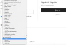
Drop-Down Usability: When You Should (and Shouldn’t) Use Them
Deciding when to use a drop-down — or when to use another interface type, such as a radio button interface or open text field — for a specific input can be tricky.
In e-commerce, most users will encounter drop-down menu inputs while navigating the checkout flow, for a wide variety of inputs.


