Frictionless design, frictionless racism
Is the shift from frictionless design to meaningful friction combating racial bias amongst users?The effects of frictionless design vs meaningful friction on users.In recent years, the tech industry has become obsessed with eliminating friction. Experiences that allow users to achieve their goals as..
Making sense of your design project by writing
Write down the narrative of your project.
Why you started this project? Is it because the executive told you to do so? Why do they think it’s a good idea? Is there any evidence to support their argument?
By writing, you’re making sense of things.
You might feel you know so little about the project a..
City design shapes our behaviour without us knowing it
We design cities and cities design usIf only we could build them the same way we build productsMainstreet, U.S.A. at Disneyland. Image: Joshua SudockA dream place. There’s a place that’s been intentionally designed, down to the smallest, most excruciating detail, to make visitors feel warm and joy.
..
The Single Usability Metric (SUM) — A completion rate conundrum
The Single Usability Metric (SUM) — A completion rate conundrumTL;DR — In the SUM benchmarking method, the calculation of completion rates creates a bias for completion rates which artificially inflates all ‘good’ scores and marks some ‘poor’ scores as ‘good’. I cover two methods to augment the SUM ..
Rethinking specialization: The return of the generalist
Breaking Down Siloes and Becoming Cross-Functional Enablers is the Future of UX
Continue reading on UX Collective »
The battle for design titles
Are you a UX/UI/Product/Interaction/Full-Stack/Visual/Digital Designer and how would you know?Working Hard • Illustration by Julia from Icons8There’s a hot debate happening on the web right now regarding Design titles. Some say we should stop saying “UX/UI Designer” — whether or not you agree with t..
Some Performance Blog Posts I’ve Bookmarked and Read Lately
Back/forward cache — I always assumed browsers just do fancy stuff with the back/forward buttons and us developers had very little control. Philip Walton tells us it’s critical that we understand “what makes pages eligible (and ineligible) for bfcache to maximize their cache-hit rates.” For example,..
Going From Solid to Knockout Text on Scroll
Here’s a fun CSS trick to show your friends: a large title that switches from a solid color to knockout text as the background image behind it scrolls into place. And we can do it using plain ol’ HTML and CSS!
This effect is created by rendering two containers with fixed
elements. The first co..
Short and long-term thinking in design: here’s why you need both
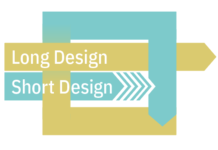
There is long design and short design. They are not the same, and you need them both.
Continue reading on UX Collective »
Understanding DesignOps as a strategic function — PART 2
PART 2Understanding DesignOps as a strategic function: measuring impactPart 2 of 2DesignOps relies on ongoing performance assessments to constantly evaluate what can be done better to impact positively the business metrics. Yes, DesignOps’ impact is quantifiable.
Credits: https://www.pexels.com/@nie..


