I Saw Two Mega Menus Today…
One was the footer of an (older) U.S. Government website:
The other was the navigation for AWS services from the AWS Console:
It’s weird how much they use the word “Amazon” and “AWS” when you’re literally logged into AWS.
Both of them have that vibe of: holy crap we have a lot of stuff, I guess ..
Dynamically Switching From One HTML Element to Another in Vue
A friend once contacted me asking if I had a way to dynamically change one HTML element into another within Vue’s template block. For instance, shifting a
element to a element based on some criteria. The trick was to do this without relying on a series of v-if and v-else code.
I didn’t..
Reduce mental shotguns in your product’s experiences
Photo by Karen Lau on UnsplashWhat is a mental shotgun?we often compute much more than we want or need. I call this excess computation the mental shotgun — Daniel Kahneman, Thinking, Fast and SlowDaniel Kahneman’s states in his book that we don’t have much control over how our brain makes sense of t..
25 Tutorials For Getting More Out of Adobe Indesign
When it comes to print design, there is no better tool than Adobe InDesign. Once you master the basics, however, you need to upgrade your skills and learn new tricks that will quickly turn you into an InDesign pro.
In this post, we’ve rounded up the best tutorials on InDesign that will help you get..
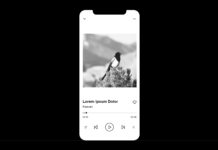
Create an interactive player prototype using ProtoPie
This tutorial shows you how to make an interactive player screen using ProtoPie.
Continue reading on UX Collective »
Experiences and errors — whose fault is it?
Experiences and errors — whose fault is it?Image courtesy of Headway on UnsplashCicero once said that “To make a mistake is only human; to persist in a mistake is idiotic.” I do understand where he was coming from, but these words were pronounced in a time when we didn’t have the experience of writi..
Is Twitter Rebrand a Glimpse at the Future of Design?
The CMO at Twitter, Leslie Berland, has announced a substantial rebrand intended to reflect the experience of using the site. The move was announced on the platform first and later confirmed on its blog.
Twitter hopes the visual identity will “fully reflect the complexity, fluidity, and power of th..
Why Is Focusing on Long-Term Goals So Difficult?
Business advice often goes a little something like this: Think about where you want to be in five or ten years, then work towards making it happen.
That sure sounds nice. But, like most advice, it’s much easier said than done. For web designers and developers, long-term goals often take a back seat..
8 Tip-Top Toggle Switch CSS Snippets
Toggle switches may not be the most noticeable UI elements in a form, but they’ve arguably done more to spice up a mundane task than anything else. Before toggles came along, we often used a single checkbox element to “switch” something on or off. While it got the job done, the look wasn’t very comp..
Find the truth. Tell the truth.
— Dana Chisnell
Find the truth.
Tell the truth. was originally published in UX Collective on Medium, where people are continuing the conversation by highlighting and responding to this story.

