Designers: mind your language
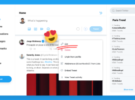
I sometimes wonder how the design community — a group of people who pride themselves on their empathy and ability to communicate clearly — have been able to create such an unapproachable profession. For outsiders, the litany of buzzwords, methodologies, and rules can at best confuse newcomers, and a..
Testing fonts for accessibility
Selecting accessible fonts for your copy is not just to help users with disabilities and special needs – it increases legibility for all…
Continue reading on UX Collective »
The UI & UX tips collection — Volume two
A collection of 18 tips to help improve your designs.
Continue reading on UX Collective »
Using design to fight racism
How might we use technology to address racial inequities?
Continue reading on UX Collective »
Maintaining attention in AR
How to direct and maintain attention in augmented reality applications.Co-Authors: Cat Hodges, Hannah Nye, and Kay Stanney
Augmented reality (AR) is a powerful tool that enhances our real world with overlaid virtual information. AR’s use ranges from virtually testing the look of new furniture in our..
The line between work and play is Garbage
What rock stars have taught me about my job.Garbage, illustrated by R. Michael HendrixSteve was supposed to be in bright colored lights on stages across the U.S. along with Liz Phair and Alanis Morrisette. Instead, he was on Zoom with me, trying to find a camera angle that didn’t make him look like ..
Adding a social layer across the web
How adding a social layer across the entire web can make it more delightful
Continue reading on UX Collective »
New directions: The cover story
New Directions: The Cover StoryPioneer designer Alvin Lustig’s fifty best book covers in one box.Lustig’s first cover design for New Directions, 1941The great graphic designer Milton Glaser once said, “there are three responses to a piece of design — yes, no, and WOW!”
WOW! is what you’ll say to New..
Affordances and signifiers
Creating designs, components and interactions that make sense to users
Continue reading on UX Collective »
What 21st-century design looks like
Don Norman and decolonial design.iMattSmart @UnsplashBack in October 2020 I had the pleasure to attend Don Norman’s Master Class transmitted by Interaction Design Foundation in which he presented the challenges to the discipline of Design and to all designers in the 21st century. To help me grasp a ..


